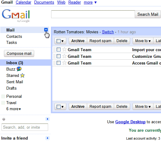
Google launched a slightly refreshed Gmail UI that hides unessential features and uses more screen estate to display your messages. Gmail's logo is smaller, the links to mail, contacts and contacts are grouped in a collapsible panel, while the options that let you select all messages, starred or unread messages are available in a drop-down.
"Overall, there's now a smaller header area that puts the first message in your inbox about 16 pixels higher on the screen than before," explains Google.

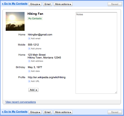
Gmail's contacts section has also been redesigned to better integrate with Gmail. The updated interface supports keyboard shortcuts, saves the changes automatically, adds structured name fields and lets you sort contacts by last name. The notes field is now really big, but I don't think it deserves so much attention.

These features will be rolled out today to all Gmail accounts. The new Gmail contact manager won't be available in Google Apps right now, but it will be released in the near future.
"Overall, there's now a smaller header area that puts the first message in your inbox about 16 pixels higher on the screen than before," explains Google.

Gmail's contacts section has also been redesigned to better integrate with Gmail. The updated interface supports keyboard shortcuts, saves the changes automatically, adds structured name fields and lets you sort contacts by last name. The notes field is now really big, but I don't think it deserves so much attention.

These features will be rolled out today to all Gmail accounts. The new Gmail contact manager won't be available in Google Apps right now, but it will be released in the near future.
